Tuesday, August 10, 2010
Bob Apple clearly not interested in the color blind vote
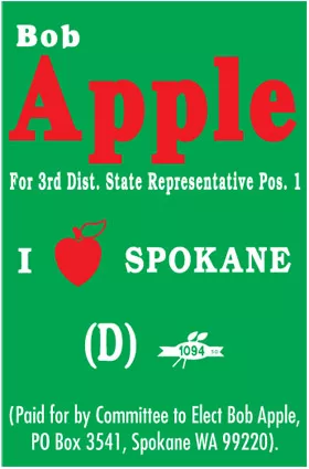
The Spokane City Councilman, who's running for state representative
in Washington's 3rd Legislative District, is likely playing off his
last name with his signs' color scheme, but the effect is as jarring as those terrible websites everybody used to make on Angelfire. It's a nightmare. Even for the ably sighted, that red "Apple" can look as if it's floating weirdly over the green. (Green on red is almost just as difficult to read.)
It's even worse for those with a color vision defect — one of the most common symptoms for which is a difficulty differentiating between red and green.
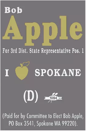
So while, to the normally sighted, Apple's sign might just look poorly designed, for those with red-green color blindness it might look something like this:

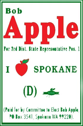
Even this clunker below (which I hastily threw together in Photoshop)
would be more soothing to the eye, amateurish though it may be.
Next time, it might be better to stick with the red, white and blue.
Designers: Can you whip up a better way to incorporate Apple's
logo and colors without giving voters eyeball seizures? Send us what you
got.
Tags: election 2010 , politics , News , Image