
As 20-year-old Max Nesbitt stands before the Spokane City Council this spring, he acknowledges that he's not there because of any pressing or dangerous issue. But it's still something he cares about.

He's been in Spokane all his life, he says, but he's never felt a "sense of united Spokane pride. Getting a sense of what Spokane means to a lot of people is difficult."
With that, Nesbitt holds up a sheet of paper displaying part of the problem: the Spokane municipal flag. Nesbitt stumbled across it when he looked up Spokane on Wikipedia. It's a hodgepodge of design elements: A crude sun is imposed on a circle containing a quartet of stick figures holding hands and the caption "CHILDREN OF THE SUN." That's slapped on a green and blue stripe beside the plain text "CITY OF SPOKANE."
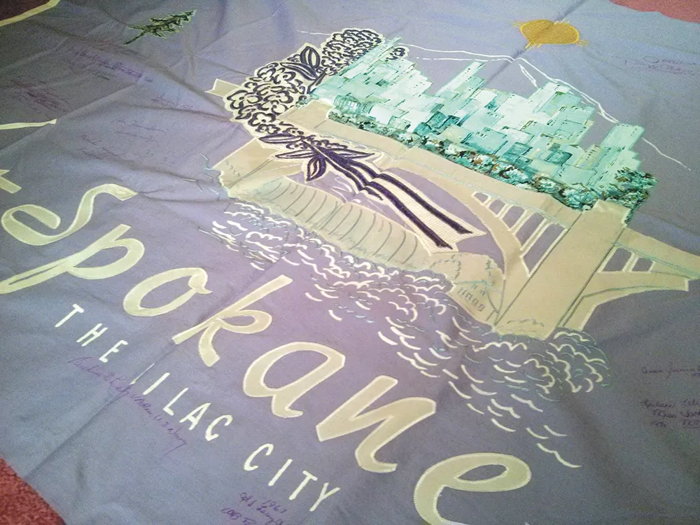
The white background of the flag disappears into the white border of the piece of paper.
"You cannot identify where it starts or ends," he says, prompting laughs in the crowd.
Back in 2012, after Mayor David Condon's first 100 days of office, the mayor brought the old city flag — designed in 1975 — out of storage, announcing it would once again return to a place of prominence. But as seven years passed, the flag was once again forgotten. The flag wasn't flying at the council meeting, Nesbitt pointed out.
"I don't like it," Nesbitt says of the flag's design. "I've talked to a number of people and I've not spoken to somebody who does like it."
Instead, Nesbitt holds up a new flag, the first draft that was designed by his friend at Evergreen State College in a matter of two hours. It's lilac, lavender and yellow, with a swoop through the middle and a lilac flower in the upper left corner. He offers it to the city, free of charge.
It was about aesthetics, he says, but also about "how we may see ourselves in the future."
City Councilwoman Kate Burke knew exactly what he was talking about. She grew up in Spokane, she's a city leader in Spokane, but she has a flag of another city — Chicago — tattooed on her skin. To Burke, a great city flag is "a puzzle piece" — one part of connecting the city with its own conception.
Sure, Spokane's current flag could be worse. A 2004 ranking of city flags singled out Pocatello, Idaho — which included a copyright and TM symbol — as the worst in America. But Pocatello fixed their flag. Why not Spokane?
That's the plan. Last month, Burke sponsored a council resolution calling for the city to "select a simple, bold, new design for our city flag." The design will be chosen by a work group composed of council members, community members, as well as representatives from the Mayor's Office, Spokane Tribe and the arts commission. And after that group establishes a few design principles, Burke says, they'll open the gates to the public to submit their designs.
We're one step ahead. We tasked a team of Spokane designers and artists — like Tiffany Patterson and Matt Bogue — to take their best crack at a redesigned city flag.
Because if you do the flag right, it appears not only at City Hall, but it also ends up on coffee mugs and calendars and T-shirts and, yes, tattoos. It becomes as much a part of Spokane iconography as the Clocktower, the Pavilion, and old dudes riding tiny BMX bikes. It gets sewn into who we are as a city. Politicians will wrap themselves in it. Merchandisers will try to make a buck off it. Protesters will light it on fire.
But do it wrong? It will make a few headlines and spark some Facebook debate. Oh, the politicians and business leaders will all make a show of loving it at first, like when your aunt gets you an itchy sweater for your birthday. But then gradually, as time goes on, the new flags will get packed up, gathering dust in storage behind the Christmas lights and the old bowling trophies, and the public will, once again, forget that Spokane has a flag.
And then, a few decades later, we'll do it all over again. ♦

JOSHUA THOMAS
Spokane has always been a city dedicated to natural beauty, innovation and cohesion. For my flag design I wanted to capture some of those factors and create a flag that represented not only the natural beauty we're known for, but also the sheer creative energy we've begun to exude. Blue represents the Spokane River, green represents Spokane's abounding natural assets, purple represents the lilac and the sun represents Spokane's Salish interpretation of "Children of the Sun."

TIFFANY PATTERSON
This flag features an asymmetrical lilac, representing our individuality and a city in bloom. The symbol in the middle is a sun illustrating our name and the brutality of our past. The blue and green reference Expo '74, but also how far we are past it. They are a reminder to not exist in the shadows of bigger cities, and symbolize our river, near nature, parks and our love and dedication to these.

CALEB WALSH
When I first saw Spokane's flag years ago, I immediately wanted to redesign it. I love Spokane and we deserve a flag that represents the beauty of this city. My design is a single lilac perched gently above the smooth, rolling Spokane River. I wanted to create a simple iconic shape that is unique to Spokane, the lilac became an obvious choice. I chose three harmonious colors with symbolic meaning. Dark forest green invokes Washington's state flag, and light-green and blue are a nod to the diagonal stripes on our current city flag.
JON MERRELL
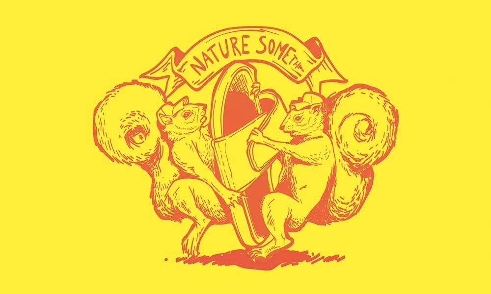
In my personal opinion, Spokane's most prolific animal, other than people, is the squirrel. Sure, squirrels aren't exclusive to Spokane. Some might argue that they're not the most majestic or noble of mascots. They're not as iconic to the area as the turkey (vetoed by the Founding Fathers from what I hear), and some people go so far as to call them rodents (which maybe, technically, they are). But there is something about the ambitious character of a squirrel that I think perfectly represents the fighting spirit of Spokane. They're scrappy. They're all or nothing. They don't always look before they leap and occasionally they get fried and cause power outages, but they keep on keeping on, despite what others might think of them. On the Spokane flag, there are two wearing trucker hats fighting over a shower shoe beneath a banner with an unremembered rendition of the city's slogan written on it.

HUDSON RENNAKER
Paying homage to the original Spokane flag, this new design includes a blue, white and orange/gold color palette. The blue vertical stripes represent the Spokane Falls which have defined our city for over a century. The sun represents the meaning behind the name Spokane, the "Children of the Sun." The white half field represents the vasts skies of the region, as well as our token winter months.

MATT BOGUE
What says Spokane more than lilacs and the Pavilion? But we're much more than that. This flag represents the tight knit community we have. In the arts, music, culinary, innovation and much, much more. We are a small town and big town that is all woven together into one beautiful abstract pavilion made of lilacs.

HUGH RUSSELL
In the upper right of the flag, a slice of yellow to represent the sun and honoring the "Children of the Sun" — the Spokane Tribe. Two separate pieces of blue represent the sky and our powerful Spokane River. A small patch of lilac sits in the bottom right, representing, well, our beautiful lilacs. Finally, surrounding and incorporated into the center of the design is a Washington green representing the forests and nature that envelops our city.

DEREK LANDERS
We're blessed to have a beautiful river running through our city. As the river flows, it cleanses. That's the Spokane I love — a city of change and acceptance that washes away the old ways and makes way for new ones. The sun represents the Salish meaning of Spokane — "Children of the Sun." It's important to continue honoring those who were here before us. The blue lines represent the river and the falls, always bringing beauty and change to our city. The green represents the trees and lands that make up our area. As Children of the Sun we are the land and the land is us. We must protect it.

JOHN MUJICA
This flag represents the diverse nature of the people of Spokane, while paying homage to the original people of Spokane. While giving a nod to the popular 1912 design of the city's flag, I wanted to reference the original inhabitants for the area. The graphic is an abstract representation of a sun — more notably, "Children of the Sun," the Native meaning of Spokane. The rays of light radiating from the central "S" are in the shape and depiction of hands that represent the many cultures and current inheritance of the area while still embracing the culture and symbolism of the Native American culture. The striped lines are referencing the river and its central importance of bringing life to the community of diverse individuals (sun hands).