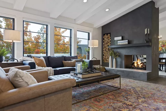
While many of us may struggle to come up with what feels like a cohesive design for our homes, we all tend to know what we like when we see it. It's just that wading through all the options for colors, textures, materials and styles — and trying to envision them in our own spaces — can be more than a little daunting. It's easy to just give up!
Shawna Byrd says she was struggling just to pick an exterior paint color for her family's home when she landed on designer Stephanie Sarro's website. "I noticed that her projects were all very different," Byrd says. "So, to me, I thought that means she's probably a good listener and is, you know, designing for the person who hired her."
The duo's first project of choosing that exterior paint is now far in the rearview mirror, and they're just finishing up their current collaboration: a complete remodel of Shawna and her husband Guy's newly bought home, a house whose style had been mired in the '90s.
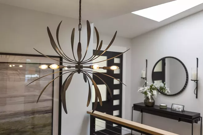
The home's location — near the Manito Golf and Country Club — was ideal for the couple, who enjoy the ability to go play a few holes in the evening. But Shawna says though the house felt good in many ways, its flow needed work to accommodate her husband's large extended family.
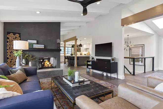
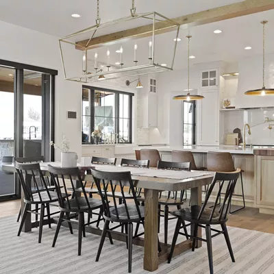
Opening up the kitchen and dining room and moving a laundry room to the lower level created a new airy living and dining space that's still on a scale that feels welcoming and cozy. Sarro ushered in the 2020s by installing black Anderson windows as well as new trim and molding throughout the home. The floors were liberated from their original shiny yellow-orange finish with a darker stain and matte finish.
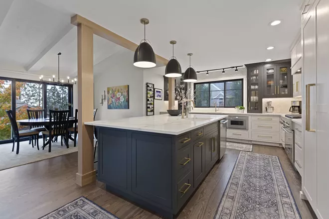
The expanded kitchen now features Bedrosians Makoto tile on the backsplash, with contrasting black and white cabinetry and elegant brass pulls.
Though the kitchen was opened up to the dining area, two posts integral to supporting the roof couldn't be moved, so Sarro opted to give them a distinctive treatment. Framing the island between the two wood-clad columns helps the seating area feel grounded and lends a structural timelessness to the design, an effect mirrored by the newly installed box beams on the ceiling throughout the space.
"She says... ‘Do you trust me?’ and I said ‘Yes, i do.’"
tweet this
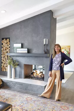
The heart of the great room and dining area is a dramatic two-sided fireplace. Originally built of unremarkable red brick, it's now enrobed in a deep gray Italian lime plaster finish crafted by local artist Annette Tyrrell. The fireplace surround's display shelves have the appearance of being hewn into the plaster. Sarro says choosing a metal mantle instead of wood permits positioning it closer to the firebox, creating a more pleasing composition. It also provides the perfect location to display two of Tyrrell's landscape paintings.
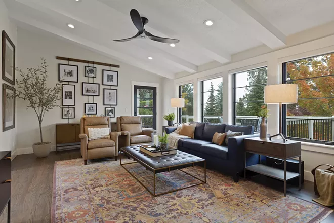
One of the project's elements that Sarro is most fond of is a large living room display of black and white family photos. The Byrds adopted their three children, now grown, from India, and they had always wanted to feature photos of the family in their home. But, says Shawna, "Guy and I are notorious for never hanging anything up."
To get beyond the impasse, Shawna says Sarro asked her for a favor. "She says, 'Why don't you give me your favorite pictures? Do you trust me?' And I said, 'Yes, I do.'"
Sarro chose the photos to feature and, using a Pottery Barn hanging picture frame rail display, she told the story of how the Byrds formed their family.
"This, to me, was one of the most beautiful things about this couple. And so that's what this wall is all about," Sarro says.
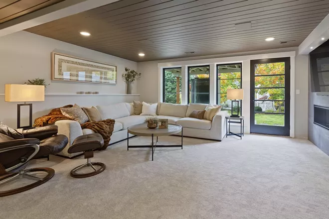
Downstairs, Sarro created a spot for casual entertaining. Instead of trying to lighten the space, she opted for a cozier touch. "I've always found that if the ceiling is painted a little darker, that really makes the room a little more warm," says Sarro.
The nearly white sectional sourced from Design for the PPL required a bit of courage for the Byrds, who loved it when they saw it and then spent months looking for something more practical. In the end, they felt comfortable with the purchase after they learned the fabric is pretty much impervious to mishaps, including spilled red wine. "You can put bleach on it, and it will take out stains but it won't affect the fabric," says Sarro.
And ultimately, it's that type of trust between a designer and client that's key to a successful project, which in the case of the Byrds' new home has spanned a year and a half.
"I like to get to know the person and what they really love," says Sarro. "Because I feel like a home should be your little sanctuary and speak to you... I feel like, why talk someone out of what they really love, what they're going to be comfortable with?"
But while Sarro's all about collaborating over the course of a project, when the project is winding up, it's time for the clients to clear out. "And then I do my thing," she says.
I like to get to know the person and what they really love
tweet this
She proceeds to decorate the entire home, based on her understanding of the clients' taste and style. When they come home for the big reveal, she tells them, "'Whatever you want to take down, let's take it down. It won't hurt my feelings.'And I'd say 98 percent of the time, they just keep everything."
Shawna and Guy left for two days. And when they returned, the couple who had for years faced blank walls with indecision, found photos and art on the walls. "It was so fun to come home and have everything hung up," says Shawna.

Palette Picking
Have a hard time settling on a color palette? Designer Stephanie Sarro says it can help to look in your closet. She asks clients to show her their favorite pieces of clothing or something they especially like. "Sometimes people will actually show me a tie or even a piece of pottery or something from their kitchen that they just love."
Client Shawna Byrd chose clothes in blues and greens, with a few pops of oranges and reds. Sarro took note, and further refined her understanding of her client's natural likes and dislikes throughout the process by sharing photos to get a yay or nay. The Byrds even went shopping with Sarro to point out items they liked.
"I love color, but it has to be the right color for that person," says Sarro. "I felt like in this house there was a real neutral palette. And that it would help to bring in splashes of color — like some of the color in the art — but not too much."
— ANNE McGREGOR
Sources
LIVING ROOM
FIREPLACE
Plaster surround and mantle paintings by artist Annette Tyrrell
AREA RUG
"Cappadocia" by Surya
WALL PAINT UPSTAIRS
Sherwin Williams 6203 Spare White
FLOOR REFINISHING
John Lorhan with St. Joseph's Flooring
FURNITURE
Madison Home, Four Hands
KITCHEN
ISLAND PENDANTS
"Bentlee Pendant" by Shades of Light
KITCHEN CABINETS
Linen White & Graphite by DuraSupreme
CABINETRY INSTALLATION
D & S Carpentry
COUNTERS
CaPaul Stoneworks
TILE
Bedrosians
TILE SETTER
David Busse
WHOLE HOUSE
WINDOW TREATMENTS
Factory Rep Blinds
WINDOWS, WINE ROOM, SHOWERS AND DOORS
River City Glass

