Not so long ago, the world of interior design was awash in bright white walls, beige drapes and pillows, and heaps of those sheepskin throws (you know the ones). The scene was militantly oatmeal, devoid of much color or big emotion.
Well, now a dark cloud of brooding hues and moody paint colors — with names like "Stormy Monday," "Wine Dark" and "Shadow" — has rolled in, and interior designers are welcoming the sea change.
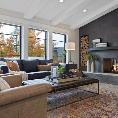
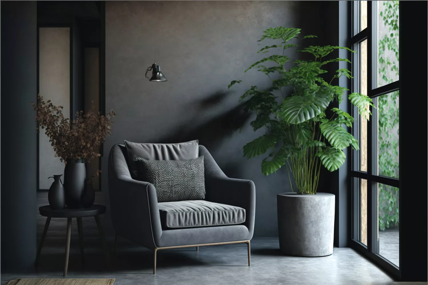
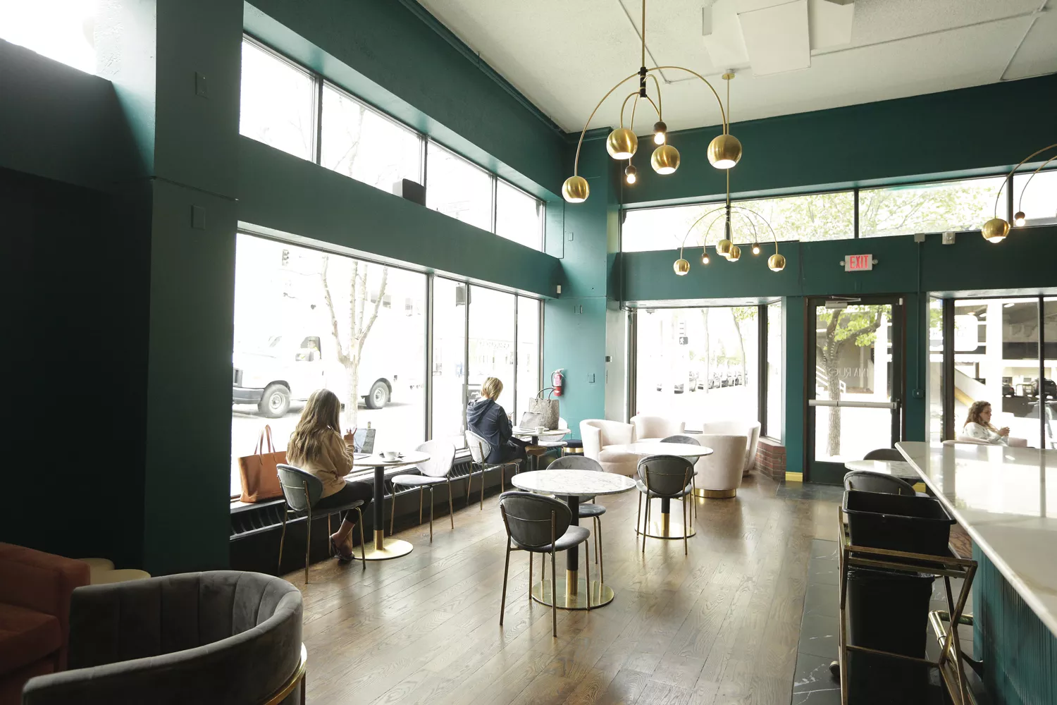
"Dark Glamour" is how Benjamin Moore describes this new palette defined by "dark colors, deep jewel tones, and dusky neutrals" mixed with metallics and near-gothic touches. Think candle-like lighting, velvet and dark wood. In downtown Spokane, Emma Rue's café already embodies the look with rich emerald walls and velvet seats accented by brass.
Ready to give your own interior spaces a good mood swing? Before you paint everything black — or the lipstick-like scarlet hue crowned 2023's Color of the Year by both Pantone (with Viva Magenta) and Benjamin Moore (Raspberry Blush) — slow your paint roller and heed advice from some local experts.
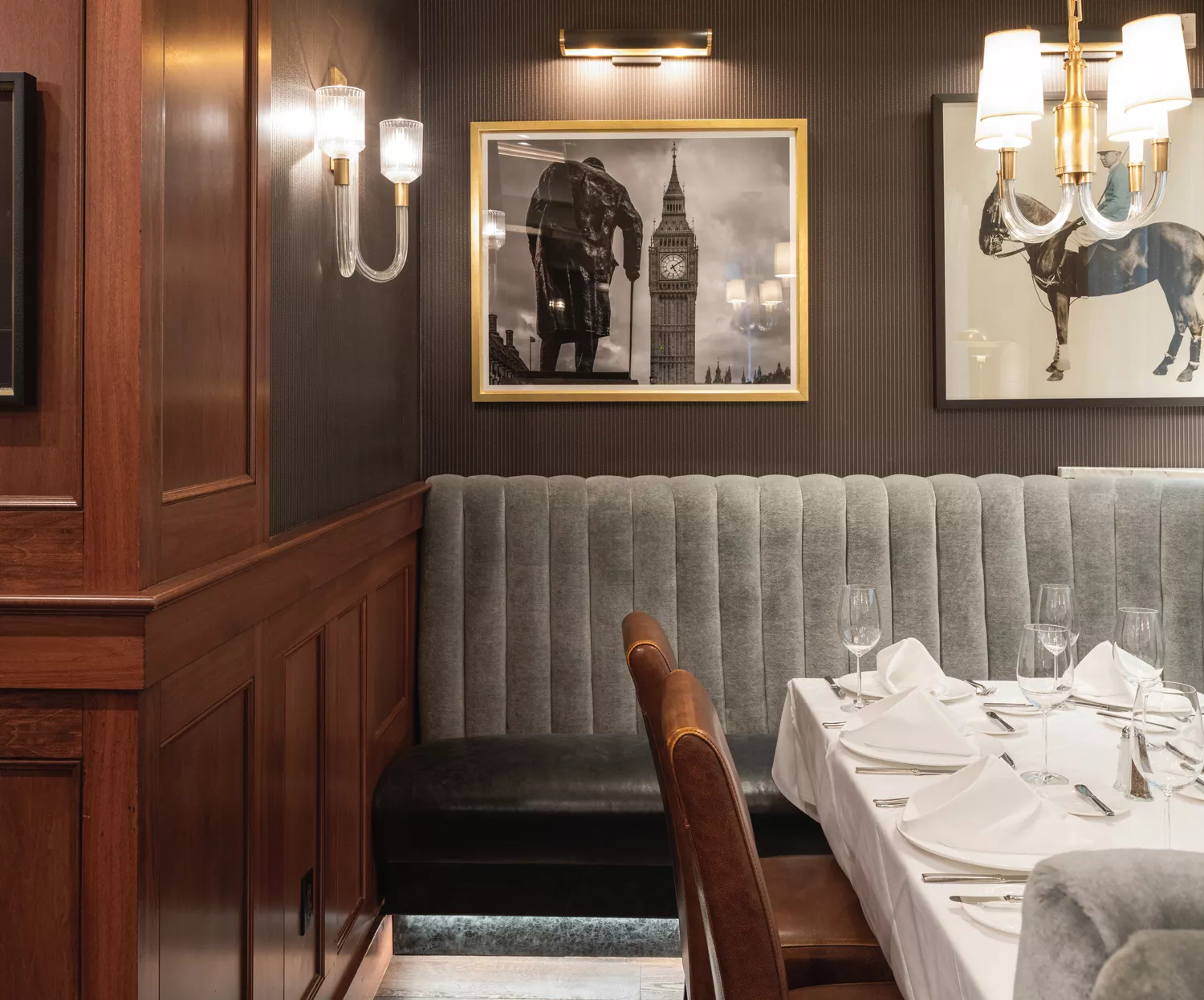
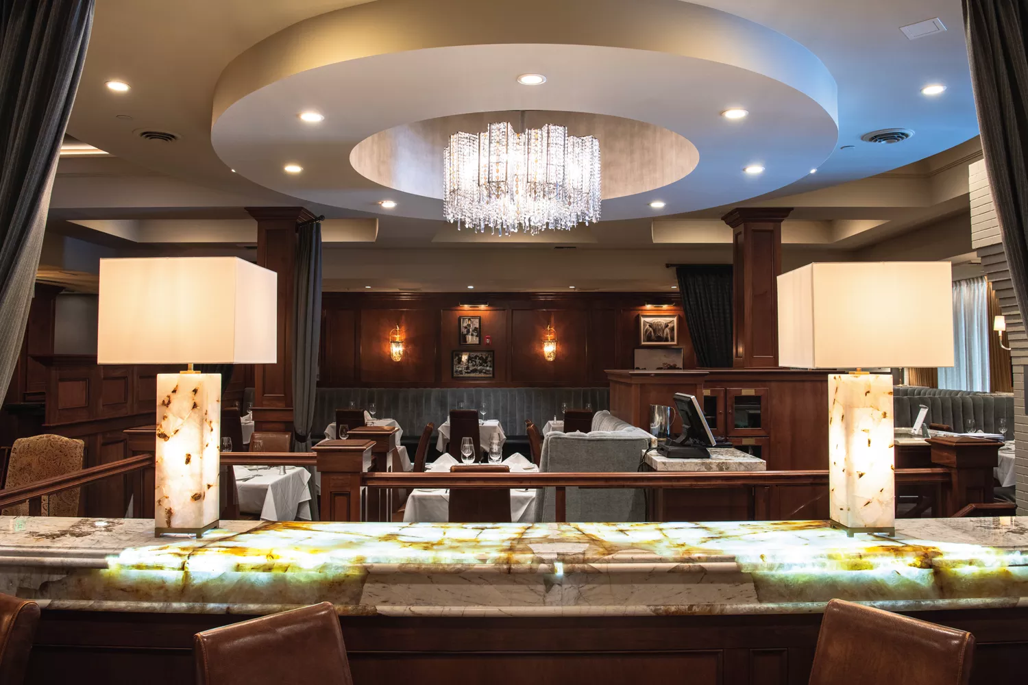
Interior designer Tammie Ladd has been beautifying Spokane interiors for over 20 years. Last fall, she collaborated with Walker Construction and Martin Springer of Revival Lighting on a remodel of Churchill's Steakhouse, balancing the restaurant's chocolatey brown ceiling accents and wood with light linens and soft gray booth backs, all lit with a dazzling chandelier and stately lamps.
She also added foliage, because when working with a moody palette, Ladd says it's important to "always bring in a living element" like a plant. "Otherwise, it can feel heavy."
Welcome Contrast
The secret to working with deeper, richer tones, says Ladd, owner of Tammie Ladd Design in Spokane, is to maintain a contrast between the lighter and the darker values, because our "eyes are just drawn to contrast, like a really good black-and-white photo. That could happen in so many ways, like a dark floor and white walls." In her own kitchen, she contrasts white cabinets with a black accent wall.
Ladd recently drenched a home study's walls in midnight blue yet left the warm-tone wood ceiling untouched. Since blue and orange exist on opposite ends of the color wheel, together they "create that complementary energy," she says.
For dark cabinets, Ladd recommends hardware that's lighter and brighter. To usher color into a gloomy-on-purpose kitchen, she adds details like sapphire blue counters, a persimmon kitchen island, or a brilliant green backsplash.
Kasey Dobbins of Foxwood Design Co. is another local interior designer who isn't afraid of the dark: "If you don't want to paint your walls dark, you could paint your ceiling," she says. Dobbins suggests brightening dark rooms with lighter-colored rugs or furniture. Though she cautions, "All black-and-white makes me feel like I'm in Cruella de Vil's house. I tend to like rooms that fall in that mid-tone range."
"A lot of people find that painting a fireplace black — or their bedroom black — is their daring option," says Dobbins. "But there are thousands of colors, millions even." Dobbins recommends people choose colors they're already drawn to: "Something you look good in, something you find comforting, maybe that reminds you of a hotel you stayed in and loved," she says. "Let your home be as interesting as you are."
Layers of Light
There's a reason Tammie Ladd is quick to add a credit for the Churchill's Steakhouse remodel to her colleague Martin Springer of Revival Lighting. Paying attention to lighting is a key to success in a room clothed in darker hues.
Dobbins says weaving "layers of light" can take many forms, from can lighting up top, to ambient sconces against the walls, and occasional table lamps. And the good news is, it may not be necessary to engage a professional to accomplish this. "There's all sorts of plug-in sconces these days if you can't afford an electrician," Dobbins says.
For naturally low-light rooms, such as basements, Dobbins recommends considering medium-tone rather than very bold or super-dark paint colors. But don't succumb to attempting to lighten things up by using white paint on the walls. For a basement room she designed for her husband, she chose dark leathers and plaid for a British pub feel. "If we were to paint that room white, it would feel like an office or a waiting room," she notes.

Texture Credit
Contrast and layered lighting aren't the only ways to uplift a moody space; thoughtful textures help too. Ladd is drawn to velvet, a "calming" material she says "provides an area of rest" for the eye., while Dobbins gravitates toward nubby bouclé fabric. She recently worked with a cloud-like coffee table (!) covered entirely in bouclé.
Woven shades, sisal rugs, waffle weave blankets and yes — even sheepskin throws, used sparingly — can also enliven dark and stormy rooms. Ladd admits she's "still a fan" of those throws if they're "used in the right way in a project."
Ladd also introduces grasscloth wall coverings to turn up the texture. In a current design assignment, Ladd is applying "really rich green grasscloth on a wall to take it to the next level." Grasscloth of the 1970s, says Ladd, "was more of an earthy, brown color." But she finds that today's grasscloth has been reinvented and improved, "woven with whites and blacks and greys, blues and greens" for more color options.
To break up solid color and add tactile intrigue, Dobbins incorporates textured wallpaper (even on the ceiling!) and foil-accented wallpaper patterns. "There's so many cool peel-and-stick wallpapers these days," she says.
For additional luminous touches — that play especially well with candlelight — DIY decorators could introduce natural stone objects, mirrored material, and metals.
Ladd thinks the current rush of color — and feeling — trickling into formerly all-white or light-gray interiors is happening now because "the masses" are correcting an extreme pendulum swing that got stuck in pale, monochrome territory. Big colors, Ladd believes, are "bringing warmth and energy back into these spaces."
Whether you're looking to shake up your own space with a color-saturated throw blanket and dramatic drapes or coat an entire room in a dusky shade of paint, there are abundant options for creating a room that's refreshingly moody.
Getting in the Mood
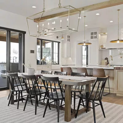
Mixed MetalsInstead of opting for all-brass or matte black metal fixtures to maintain one uniform style, Tammie Ladd recommends mixing metals to ensure the longevity of a space. Allow for future flexibility!
A Wide Swatch
When choosing a paint color, test a sizable patch on your wall and observe how it looks throughout the day, especially at night. Paint on a north-facing wall will differ from a south-facing one. Dobbins warns, paint from "a Pinterest board with Arizona lighting is gonna look far different than light in Spokane."
Leave it to the Pros
Darkening cabinets and built-in fixtures is one way to achieve a shadowy look. However, Dobbins recommends turning to professionals for that task, as things can go wrong quickly and, "It's really difficult to paint cabinetry so that it looks nice."
Previously Loved
For a low-commitment route, scoop up secondhand furniture and unique pieces to pull together a sultry room. Dobbins buys vintage lamps and outfits them with new shades. "Paint a vintage table oxblood [red]," she suggests. "It's an easy way to figure out if you like deep colors."