Why We Did It
By Jacob H. Fries, managing editor
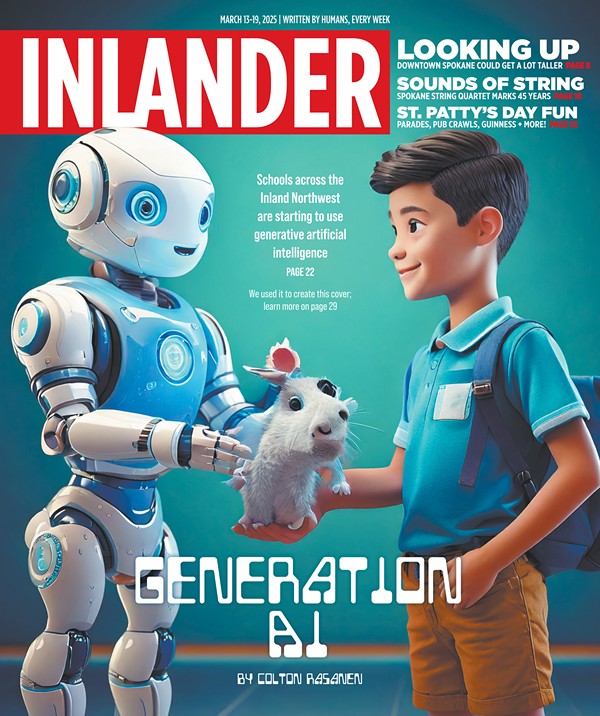
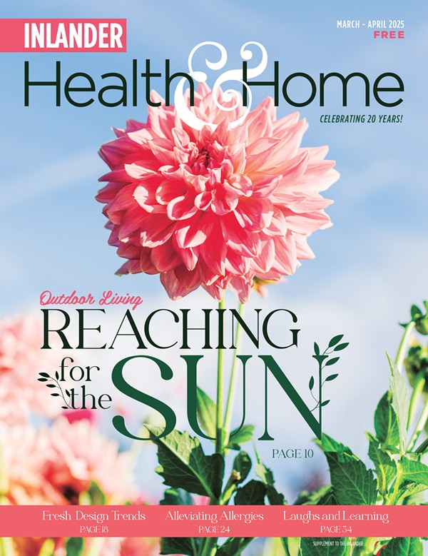
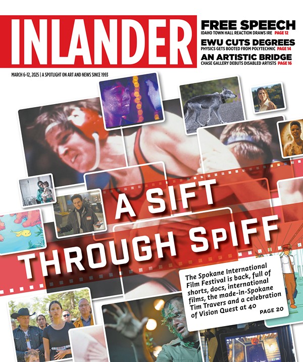
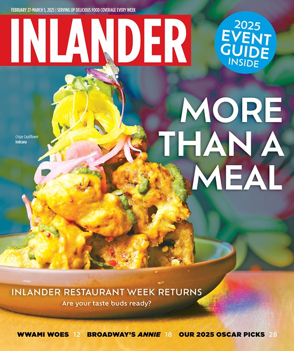
These days, when a newspaper rolls out a new design, it’s usually to obscure the fact that the paper is cutting back on content, pages and staffing. Here at The Inlander, we actually have the opposite problem: We’re growing. Our reach in the community, our circulation, our advertising, our staffing and our journalism — they’re all bigger and stronger than ever. And so we wanted to update the look and content of the paper to reflect the exciting things going on here in the Inland Northwest.
Some of the features you’ll notice:
- More news reporting. Weekly newspapers have historically acted as a supplement to dailies and TV, but with those media shrinking, local, independent weeklies like The Inlander have increasingly become the go-to place for in-depth reporting and context. You’ll see we’re devoting more space than ever to news and have added some new features into that section, too.
- Expanded food coverage. We’ve added pages to our food section to accommodate more news about our local restaurants, as well as the latest developments in the world of cuisine. If you’re looking for a place to eat, we’ll be giving you more ideas than ever as we tell you about new restaurants and check in on old standbys.
- A guide to the best local events. We know our readers use our calendar to plan their week, so we have added pages highlighting what we believe are the week’s best offerings. You’ll also find in our events sections a rotating feature highlighting places where you can sing karaoke, play trivia, dance and much more.
- Integrated online features. We are everywhere — on Facebook, Twitter, Tumblr, on your smartphone and in your email — and we integrated some of those features into the paper to help you stay connected.
A newspaper inhabits a pivotal place in a community — it’s a living thing that is always changing with the times, and we hope our readers will continue to help us grow.
Tell us what you like about the new design, tell us what you hate, tell us how we can better serve you. A community needs a newspaper, and a newspaper needs a community, and we value your feedback.
Please send your comments to editor@inlander.com.
How We Did It
By Chris Bovey, art director
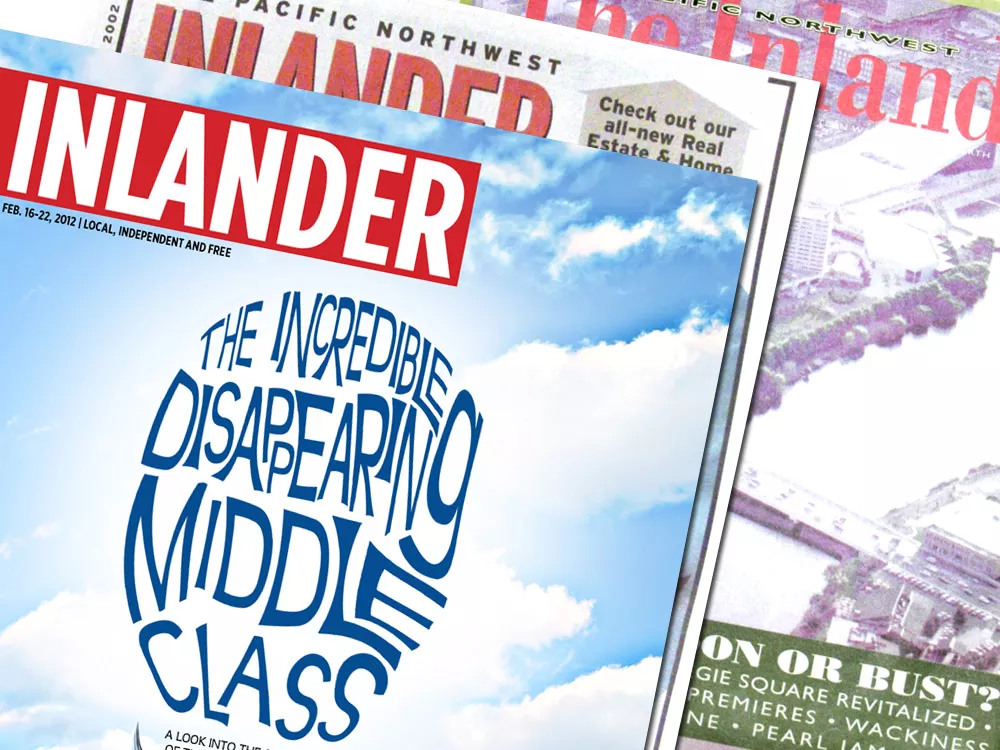
In redesigning The Inlander for the first time in 10 years, we started by listing the aspects of our design that we had come to hate. Near the top of the list were the brackets, which were everywhere — on our cover and every other page inside. They had fallen out of favor and not just with us. I once got a reader’s email showing 20 examples of companies using brackets in their advertising and comparing their use with Portlandia’s “put a bird on it” idea.
So we started over. Blank slate. We studied other newspapers and magazines, borrowed what we liked, threw out a ton and, through trial and error, tried to create a design that highlighted our content: our articles, our great photography and our artwork.
Many of the choices we made, you’ll hardly notice. Others, we think, will make a huge difference.
- Hit the road, Interstate. We had used a font called Interstate since our last major redesign in 2002. It was everywhere from headlines to captions and sidebars. Even our logo was in Interstate. So, in choosing a new font, we wanted something more modern, that kept in line with our established brand. After countless hours of font browsing, we landed on Gotham. Interestingly, this same font was used by Barack Obama’s campaign and has been called the linchpin of his entire campaign imagery, not that that factored into our decision. It just seemed to fit.
- Give me some elbow room. I love our paper, but sometimes it felt a little cluttered. So we added more white space. This makes the page feel airier and hopefully draws you in. You will notice this mostly between the ads and our stories. Kind of like your neighbors, you love ’em, but sometimes you both need a little space to flourish.
- Don’t box me in. Our photo captions were trapped in bright red boxes that competed for your first glance on every story and, at times, distracted from our award-winning images. So now you will find those little guys tucked under the bottom right corner of photos.
- Show me the way. With the red caption boxes gone, we wanted to use the color red as an accent helping you navigate from page to page, section to section. Red generally marks the starting places — the beginnings of sections and stories.
We’re excited about the results, but if you have suggestions, send them my way: chrisb@inlander.com.

