For those not professionally trained in the art of interior design or color theory, picking something as seemingly simple as a paint color for a single room can feel like home improvement roulette.
Warm or cool? What are undertones, anyway? What if this paint color clashes with the wood floors or finishes? What if I change my mind about this green wall paint in two months?
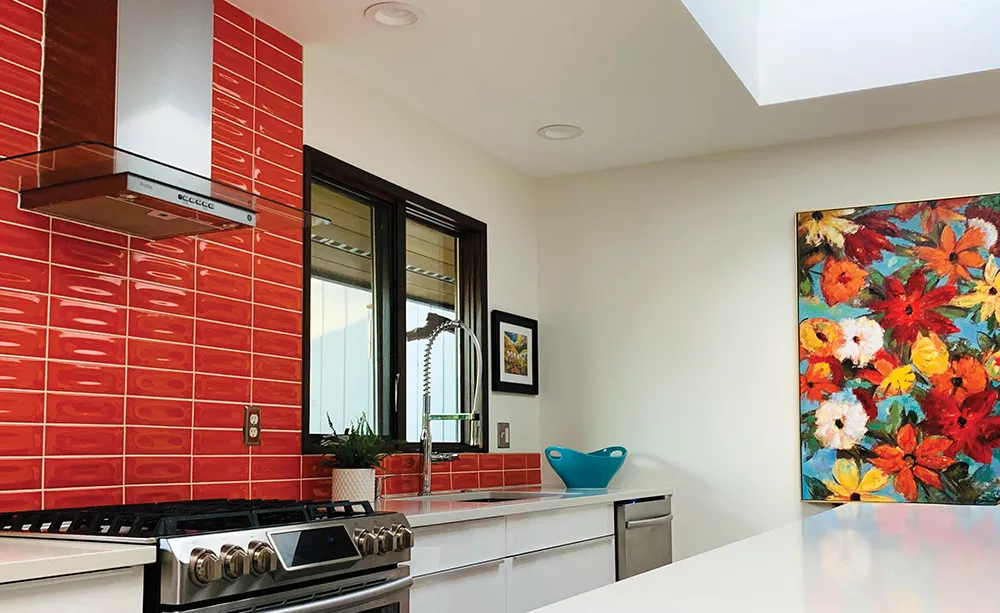
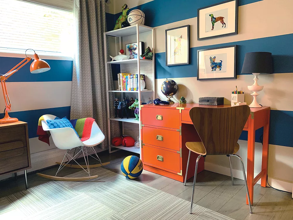
While some renovation projects really are better left to the experts — like the three Spokane-based interior designers featured here — there's also no need to feel overwhelmed by the choice to bring more brightness and color into your home. From small accessory pieces like throw pillows, all the way to floor-to-ceiling wall paint, big and small color updates can totally transform and refresh a space.

NATURAL INSPIRATION
Not sure where to start when it comes to picking a color scheme for your home? Look to nature, the world's original "interior" designer.

Designer Carter Crandall, who runs the new Spokane office of San Diego-based Blythe Interiors, loves to use colorful birds, butterflies and other natural elements for color inspiration.
"I have a Pinterest board that I always end up sending people of bird color schemes," Crandall says. "If people are scared and say, 'What goes with this and that?' look at pictures of birds. It's like God's way of saying 'these colors work together.'"
While the males of most bird species carry the most color — bright blues, reds, pinks, greens, yellows, oranges and more — she notes that many of these eye-catching hues are balanced out by some neutral feathers, too, like white, black, grey or beige.
Brilliant tropical species can become inspiration for more vivid palettes, while a less flashy (but still beautiful) great blue heron with its blue head and tail feathers, gold beak, dusty grey-blue body and black legs could unite for a more muted space that still has pops of brightness.
Photos or paintings of bird species whose foliage became the source of inspiration for a space's palette can even be used as art to anchor the space, Crandall says.
"Let's stick that bird in there and — boom — we've made it work."
To balance a space's colorful elements so it's not too overpowering, Crandall also recommends elements like green houseplants and other natural materials, found in natural fibers or wood, to add texture and interest.
"Greenery is color and plants are pops of color," she says. "It's the cheapest thing you can buy, and it brings life to the room and plants come in various shades."
TREND CAREFULLY
While plenty of trendy "colors of the year," like Pantone's living coral, or the ubiquitous rose gold/millennial pink, can make big waves in both fashion and interior design, their brief time in the spotlight can also make a space feel dated if you go all in.
"We're careful using trendy colors," notes HUE Color and Decor co-owner Jana Oliveri. "We might accent with trendy colors or put them where you could remove them later, so not necessarily a whole wall, but maybe a small space — we might do a half-bath."
Another option to incorporate currently popular tones is to pair them with classic hues that never go out of style.
"Navy is a classic, we use a lot of that," Oliveri notes. Neutrals can also help create that balance.
"We love color, but we love a space with blended neutrals, and we do pops of color and you're not going to walk in and it's rainbow or Sesame Street," she adds.
Don't be afraid to bring a trendy color of the year into your home, however, if it's also a color you truly love.
"Make it your space, not just because a color is on trend, but pick a color you love and be daring and make it your own," adds HUE co-owner Cathy Peroff.
This rationale is partly why Crandall often asks to see what's hanging in a client's closet when she's touring their home, to test the waters for color aversion or embrace.
"I say 'Show me your shoes and the funnest piece you have in here.' Even if it's muted, like a pale purple... it gives me a place to start. They like blue and purple and are comfortable with the cooler tones."
If she finds lots of bright colors, or even pops, like a bright red handbag, Crandall can infer that a client might be willing to go a little bolder in their living spaces, too.
START SMALL
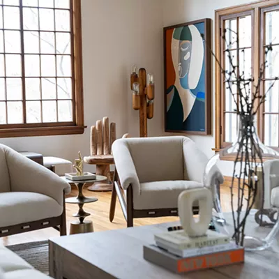
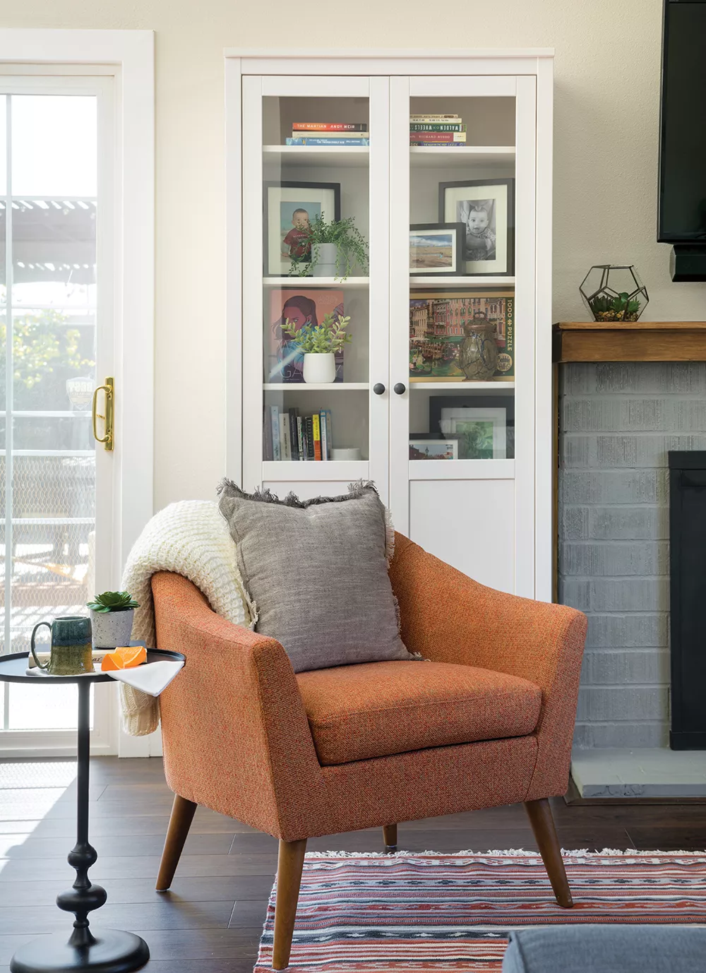
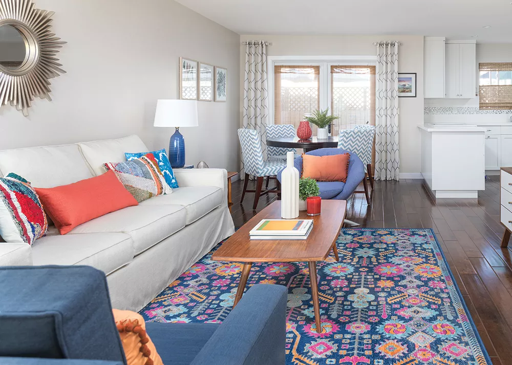
For clients who aren't ready to dive deep into the rainbow, designers suggest testing the waters with things that are inexpensive and easily changed, namely accessories.
"The rule in decorating is always start with the most inexpensive pieces first, and work from the floor up," Peroff explains. "Then you start to add things that are interchangeable."
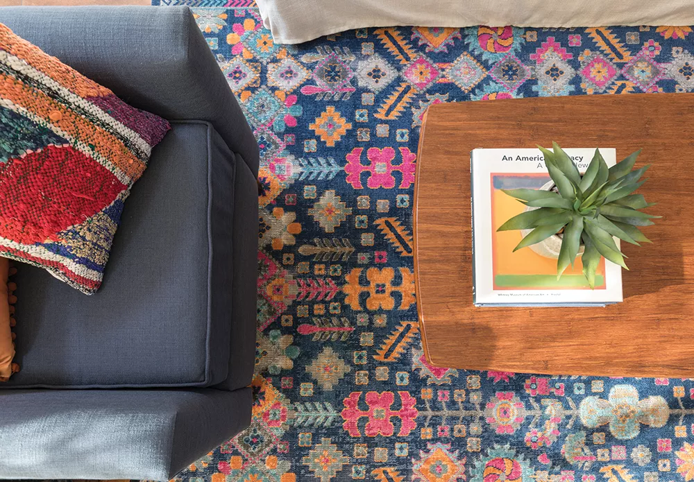
She lists off examples of these items, like an accent chair, rugs, throw pillows, poofs, planters, house plants and photos or art on the walls.
"Anything organic is one of our easiest ways to show bright color," Peroff says. "If you're really terrified, just go get a bouquet of flowers, put it in a room and see how it changes your space. You can bring in an amazing pop with just a floral arrangement."
"People are often afraid to use color, and I think a lot of that is commitment," Oliveri adds. "The other fear is just in how to choose and how to start, and how to pick the colors and pair them together."
If you try these tips and aren't sure it's working, Crandall suggests taking a photo of the entire space.
"We're so emotionally attached to our spaces, when we take a picture we become an observer of the space, and see things we might not normally see," she explains.
UNDERSTAND UNDERTONES
Undertones can, for example, make a red (usually a warm color) look different based on things like lighting and other colors around it. Warmer reds have more orange and yellow undertones, whereas a cool red is going to have some bluish or purple undertones.
"So [a client] knows they want green, but do they want a soft green or do they want a yellow or blue undertone? We help with that aspect so it blends and gives that overall feel" they're going for, Oliveri notes.
A space's size and other elements, like the tone of natural woodwork, the direction of the sunlight coming into the space and what kind of interior lighting is used, like LEDs or incandescent bulbs, can all change how a color looks because of undertones, she explains.
If you're picking a darker color, like navy, Peroff also cautions against picking a few shades lighter than you want simply because you're worried it will appear too dark.
"Don't bump up three colors on the chart for a small space assuming it'll look darker," she says. "Pick the color you want to go with."
Undertones also can impact what colors complement each other, and how balanced a space with several different colors will feel.
"If a room is overall warm, then we'll balance with cool colors and tones," Oliveri says. "If you go into a room with maple woodwork and it's beige and it's all warm tones — or the opposite, it's a grey and white stark space, and there is no warmth — we bring in wood and plants and organic materials and warmer colors. A lot of time it's just missing those organic natural elements, to bring it all together and balance it out; not always paint color."
MEET THE COLOR EXPERTS
Blythe Interiors: Carter Crandall
A recent transplant to the Inland Northwest, Carter Crandall oversees the new Spokane office of the San Diego-based design studio Blythe Interiors, which specializes in affordable residential projects at any stage, from a single room refresh to new construction.

"If the client has a couple thousand dollars [budget], we'll facilitate that and get as luxe as we can for that price point, and really honor what the client wants," Crandall says.
The designer, with 20 years of industry experience, is currently in the process of remodeling her family's 1990s-era North Spokane home, and describes her personal style as transitional, incorporating modern with vintage pieces for a cohesive look.
"That is a typical client as well, because as we get older, things get passed down to us, and we don't want to let them go but want to make it work in a modern contemporary space," she notes.
Portfolio and contact: blytheinteriors.com
HUE Color & Decor: Jana Oliveri and Cathy Peroff
This newly founded Spokane design studio, owned by longtime friends Jana Oliveri and Cathy Peroff, specializes in helping clients choose cohesive color palettes for their homes, no matter the project's scale.

"When you do remodels and projects, there is really no one we know of really [in the area] focused on color," Oliveri says. "Paint is one of the first things people want to do to make a change because it's the most inexpensive."
After spending years working at a local Sherwin-Williams paint store, Peroff became known by clients for her expertise in choosing, matching and combining colors to fit specific needs.
"I just realized I had a knack for it — putting together color and helping people get on historical registers and suggesting colors, and just really diving into all features of color and decorating," Peroff says.
One of HUE's specialties is helping homeowners find era-appropriate paint colors for historic homes, which, if listed on a historic registry, fall under strict requirements when making any changes. The firm can also re-envision any space beyond paint colors to create a fully cohesive space, from finishes to furniture.
"I've done an entire room off a pillow or a rug or a picture," Oliveri notes. "You can create any paint color you want going off a piece of art or pillow. But often when you start with a paint color, you're limited by aspects of that room."
Portfolio and contact: huecolordecor.com